


In creating your website, don't overlook mobile responsiveness; with the surge in mobile users, it's essential. Avoid overwhelming visitors with information; instead, prioritize what's truly important. Site speed is another critical factor – a slow site can drive away potential return visitors. Finally, keep your navigation user-friendly; the sooner your visitors find what they need, the better their experience. Remember, there's a fine balance in web design that combines aesthetics and functionality. Stay with me to navigate this realm one tip at a time. Trust me, you'll be pleased to have these insights under your belt.
Key Takeaways
- Avoid neglecting mobile responsiveness, as an increasing number of users browse on mobile devices.
- Do not overload your website with information, prioritize essential details for better user engagement.
- Ignoring website speed can harm user experience and increase bounce rates, therefore, it should be prioritized.
- Overlooking easy navigation can lead to user frustration, so design should focus on intuitive guidance.
- Ensure a user-centric design approach to cater to the unique needs and behavior patterns of your audience.
Ignoring Mobile Responsiveness
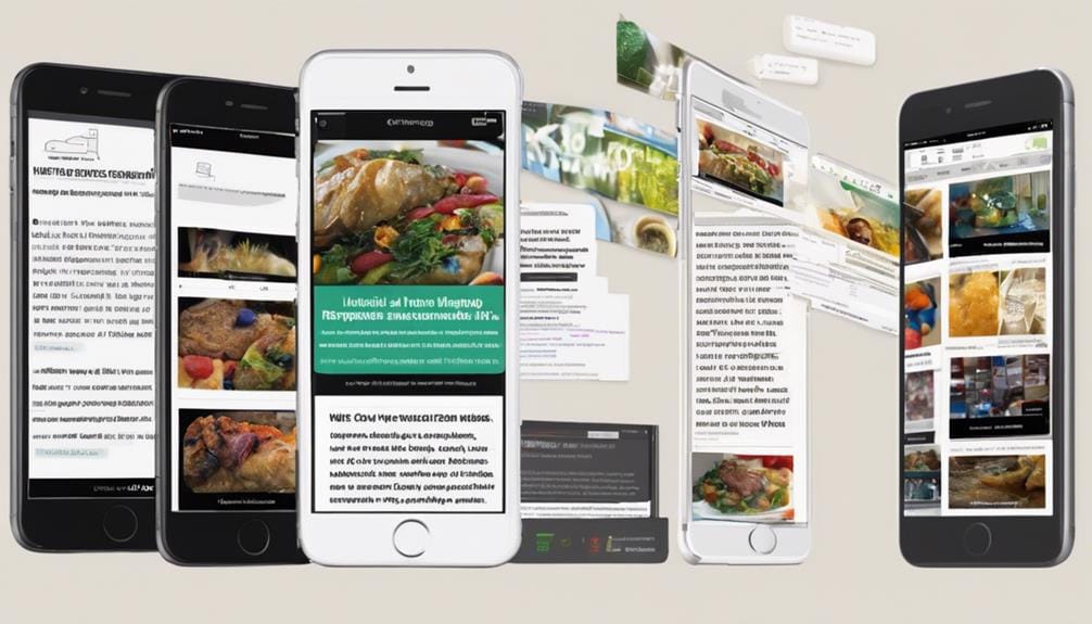
While it's easy to get caught up in the aesthetics of desktop design, ignoring mobile responsiveness can be a huge mistake. With the increasing usage of mobile devices, it's imperative that your website adapts to various screen sizes without compromising user experience or visual appeal.
As we've seen in Pretoria's web design scene, prioritizing fast load times and simplified processes is essential, even on mobile devices. Not doing so can lead to a poor browsing experience for mobile users, potentially causing a substantial drop in traffic.
It's not just about shrinking your site to fit a smaller screen, but about reimagining your design to cater to the unique needs and behavior patterns of mobile users.
Overloading With Information
Pivoting slightly from mobile responsiveness, another common pitfall in web design is the tendency to overload with information. It's tempting to demonstrate your innovation by packing every bit of detail into your site, but this can harm your user experience. A site cluttered with information can overwhelm visitors, leading to confusion and quick exits.
Instead, establish a clear visual hierarchy. Prioritize your information, placing the most essential details at the forefront and less important ones as secondary. This demands creativity and a detail-focused approach, but it'll guarantee your site is digestible and captivating.
As per the Web Designer Selection Criteria, choosing a designer with a user-centric design approach can help avoid information overload and enhance the user experience.
Neglecting Website Speed
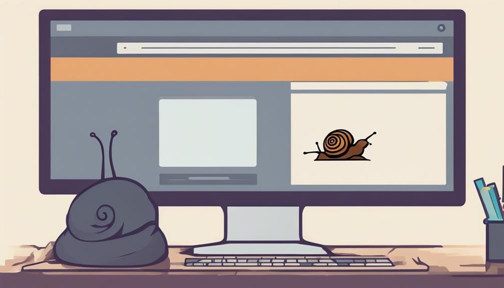
Your website's speed is an often overlooked factor that plays a crucial role in user experience. We're living in a fast-paced digital era where users crave instant gratification. As mentioned in the website performance optimization section, 47% of consumers expect a web page to load in 2 seconds or less, and slow-loading websites lead to higher bounce rates. Your site's sluggishness could be the one thing standing between you and your potential customers.
Here are three innovative ways to boost your website speed:
- Optimizing Images: High-resolution images may look crisp, but they're bulky and slow down your site. Use modern formats like WebP to decrease file size without losing quality.
- Caching Content: By storing a version of your site on users' local devices, you can significantly reduce load times on repeat visits.
- Minify Your Code: Unnecessary characters in your site's code can add to its weight. Trim it down for a leaner, faster site.
Don't let speed bumps derail your user experience. Prioritize performance.
Overlooking Navigation Ease
Just as a high-speed website attracts users, easy navigation hooks them in, making them stay longer. It's a web design mistake I've seen often: overlooking the user interface's navigation ease. But why does it matter?
Imagine stepping into a maze, no exit sign in sight. Frustrating, right? That's how a user feels on a cryptic website. It's pivotal to design a seamless navigation process to enhance the user experience. Simplify menus, use clear labels, incorporate a search function. The goal is to intuitively guide users, not test their puzzle-solving skills.
Frequently Asked Questions
What Are the Best Color Schemes to Use for Web Design?
Choosing the ideal color scheme is like creating a magic potion. You need to master contrast ratios, explore color psychology, and innovate. Select shades that communicate your message effectively, and remember, first impressions count!
How Often Should I Update the Content on My Website?
I'd recommend updating your site's content frequently, ideally once a week. Regular updates boost SEO and engagement. But remember, quality trumps quantity. Don't sacrifice your content's value for the sake of an updating schedule.
Is It Necessary to Include Social Media Buttons on My Website?
Incorporating social media buttons enhances user engagement. It's a savvy marketing strategy promoting social sharing. It's not just about having a website, it's about integrating it with the digital environment around you.
How Do I Make My Website More Accessible for Visually Impaired Users?
To make your website more accessible for visually impaired users, guarantee screen reader compatibility and use text-to-speech tools. These improvements will enhance their browsing experience, making your site more inclusive and user-friendly.
What Are the Copyright Considerations When Using Images on My Website?
Getting through copyright for web images is no picnic. You've got to grasp 'fair use' and image licensing. Always make sure you have permissions or licenses for images used, or you're opening a can of worms!